Showing posts with label thousand parsec. Show all posts

Thursday, September 4, 2008

A quick update, just to break the silence

I've posted a new Windows build, and am currently trying to get the client to work fully with the python-ogre deb on Ubuntu. As expected, getting python-ogre to work on Mac is quite a chore, I'm almost there, got everything compiled but running the demos gives me a "wrapper" error, and I'll probably have to understand how the code generation in python-ogre works to figure it out.

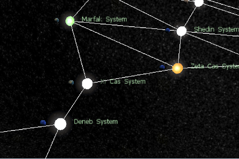
Packaging issues aside, I've made a few updates to the client. The lines in the screen represent "Wormholes", which are basically routes between star systems. Currently, only the Risk ruleset uses this feature, so lines won't display anywhere else, such as on the demo1.thousandparsec.net server which usually runs Minisec.


I've also tweaked the "Information" window to show more useful information such as the planetary resources (I tested it with the "Armies" resource in Risk). In general, I'm trying to locate more crashes by testing the client with different systems and python-ogre builds. OgreAL has been a little problematic, and it's one of the things which I am trying to get working with the linux python-ogre deb file.

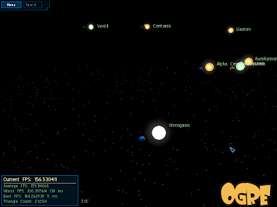
My main concern about the client is the performance on older hardware. Mithro informed me that even the login screen runs at a crawl on his laptop, which is probably due to the large textures used in the skybox (1024x1024). I guess a solution to this would be to offer a lower-resolution skybox thats selectable from the options menu.

I've started my industrial attachment, so I'm pretty much limited to weekends. Nevertheless, I'll be continuing to update the client, and when tp04 support has been added content management will be a lot more elegant, allowing "media" tags which mean no more hardcoded graphics. Another thing I'm looking forward to is more battlexml support in the servers. On my end, I also hope to include some shaders to give game objects a more realistic look, but there are still many things to work out before I have time for that.

P.S. If you zoom in on the pictures it kinda looks like those old VGA games.


From Dev Hobby

Sunday, August 3, 2008

Sounds and Battle

This week I took a look at introducing sound into the client. I found OgreAL a snap to use, it's API is modelled after the built-in Ogre managers such as material and resource manager, so not only was it familiar but also cleanly designed. Unfortunately, technical problems (crashes without any indication of the error - my favourite!) arose when I tried running the code, which I attributed to driver issues, as switching to "generic software" audio drivers - done by passing in a parameter during creation - solved the problem. This parameter is not available for Python-Ogre 1.1 which uses an older OgreAL API.

So all I had left to do were the sound effects.

As I mentioned, I found a program for generating ambient soundtracks last week. It's really a sine wave generator and I'm currently trying it out as a background track. I haven't thought much about what sort of music would be suitable for a game of Thousand Parsec, perhaps I will have the client play any .ogg files it finds in the directory, similar to how Oblivion does it. This way, the user can specify his own soundtrack, although it would be nice to have some original music of our own too.

I spent a while trying to create sounds for other parts of the client. Right now, I've put in a "engine rumble" and clicking sounds for buttons on the gui. Once again, I found a useful utility for these sounds, called sfxr. Most of the sounds produced are pretty lo-fi, but it's suitable for stuff like laser noises and the engine rumble was made from this too (plus some processing in audacity). Hm, there should be some way to embed sounds in blogs too...

I think that the background track does add a lot of atmosphere, but my taste in music is pretty much like that anyway (see Drone Zone on SomaFM) so hopefully it won't annoy others. The sound effects will require a bit of tweaking as well, as their volume varies based on the user's location (automatically handled by OpenAL) and they can sound too loud or too soft at times.

One of the primary motivations for adding sound was to supplement the Battle module, a standalone program for viewing BattleXML files.

Currently, it does not process the actual battle, but it does create and show the initial locations of the fleets. I'm still figuring out how to define weapon locations and attach them to the ships, which should be fun once it is done. Also, there seems to be some texturing issues with the models as well, hopefully I can fix them in Blender.

An additional windows installer script has been created as well, which actually just places the compiled client into your program files directory and create start menu shortcuts. The process of creating the installer actually exposed some bugs - although everything works, on shutdown the client outputs an error log, saying that some background threads had been forcefully shutdown, which made me realise that perhaps I hadn't been closing the client library threads properly, something that I have yet to look into.

Next week, I will be finishing up the battle module and tying up loose ends:
- the starmap could use a navigation bar for zooming and centering
- the title screen should have the TP logo
- using theora to display the intro movie
- a minimap for lost players
- writing up documentation
- packaging linux and mac binaries (big problem here)

Sunday, July 20, 2008

This week in TP

This week, I finally figured out how to do proper camera rotation in 3d. The actual code turned out to be simple. At first, I wanted to use spherical coordinates to position the camera, as I had success with using polar coordinates for the radial menus. By storing the vertical and horizontal angles and treating radius as the zoom distance, I could convert them into 3d coordinates by applying some formulas. This worked only for rotations along the Z-axis (meaning that the world was "rolling", done by moving the mouse left and right). However, for rotations along the X-axis (pitch) it would refuse to rotate properly - upon reaching the horizon angle it would "bounce" back again.

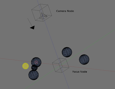
In the end, I put the camera inside an OGRE scene node, and made it the child of another scene node which would act as the focus. Hopefully this tilted diagram isn't too confusing:

In the diagram, you can see the camera floating at a distance above the map, which contains several planets. The focus node is always level with the other map objects, while the camera node can zoom back and forth. As I mentioned, the camera node is a child of the focus node and by rotating the focus node directly, OGRE will apply any transformations to it's child nodes, causing the camera to rotate around the focus node.

Allowing the camera to look around freely posed a problem, mainly with the starry background as it was a flat field of stars. Here's a picture breaking the illusion:

Thankfully this was actually quite easy to fix. OGRE uses particle emitters, which spew out particles in various arrangements, and there was a Hollow Ellipsoid emitter which I could use to create a starfield surrounding the camera. The manual is not very clear on how to use the Hollow Ellipsoid, the inner_ parameters are actually numbers with a range from 0.0 to 1.0 specifying the percentage of inner volume which should be hollow.


There always seems to be a cluster of stars at roughly around the same location, I'm not sure why. Letting the camera roam also let a few more issues crop up, such as the planet rotation. Previously, they were facing the player who was looking from overhead, since otherwise all the player could see would be their polar caps so I had to rotate them back again. Another stickier problem is the panning of the camera. Since the camera can pan in any direction, it screws up the zoom if the player pans downwards or upwards.

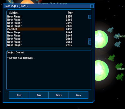
Finally, the messages window layout has been changed to include a panel showing all the message headers. As I said in the previous post, the layout looks like it could do with some tweaking.
Next week, I will implement the ship design window, although I've not been able to create ship designs using the existing client yet, I should take a look at at least letting the player view the ship designs, or else he won't know how badass his fleets are. :)

Another thing will be the order queue management, which refers to deleting and editing existing orders.

There will be a turn update window, showing new events received upon a new turn.

Finally, I will create setup packages for Windows, Linux (with the help of fellow Thousand Parsec developers) and Mac (which I will be working with my mentor for - this may take longer due to issues with Python Ogre). Although not a real release yet, getting the build process done will be a load off my mind. No use working on a project if nobody can run it after all. :)

Interface comparison

This post is mostly a screenshot comparison of the two different interfaces of the original wxWidgets client (tpclient-pywx) and the OGRE client (tpclient-pyogre). Okay, maybe they are not so different... but it would be interesting to see the layouts in different environments anyway.

First off, we have the bread and butter of any 4x strategy game... the map. The pywx client shows each system and which objects are in that system, indicated by the circle surrounding it.


The pyogre client has two views: an "iconised" view when the player is zoomed out, and a 3d view when viewing objects close up.

The pywx client keeps new order parameters and the order queue within the same area:


In the pyogre client, new orders are chosen from a radial menu, which produces the new order window.
There is also a separate order queue window for manipulating the orders of the selected object (not yet, sorry :()

The pywx system viewer shows the tree of all objects in the game.

The pyogre system viewer needs some work, once the client fully makes the move to CEGUI 0.6 I'll be able to include the new tree widget in.

Information window, showing some attributes of the currently selected object. I've always thought it looked a bit like debugging output. :)

The information window for pyogre shows similar details.

The message window for pywx, which supports html and can open your browser if a message contains hyperlinks.

The message window for pyogre. It looks a bit 'chunky', maybe I should have an option to toggle the message list panel?

The design window. I have been working on this feature, but it is not complete yet as I can't seem to create new designs in MTSec, even with the pywx client.

Sunday, July 13, 2008

Animated camera

This week, added some animation to the camera movement to make it more smooth. When zooming in or out, it will move gradually instead of instant 'steps' like before. In addition, there will be animated panning when a system is double-clicked on the system list, or when pressing 'c' to center on the selected object, or when pressing "goto" in the message window. Since it will move in steps every frame, it is somewhat slow when the frame rate is low. This could be solved by having calculating the step size based on the frame rate. A harder problem is how to rotate a camera in a spherical manner around an object, which is probably a staple of most 3d games.

I also added some movement for the ships which will occur after a turn update. This allows you to roughly see where they are going, particularly for enemy fleets.

I guess this week's changes are mostly animation based, so it's a little hard to take screenshots.

Some additional minor fixes
Message window parses html messages now. This was largely thanks to Tim Ansell's suggestion to look at the htmllib and formatter library that comes with python, which saved me from having to strip out the tags manually. I still can't believe the breadth of python's built-in libraries sometimes. Batteries included indeed. One possible addition is to add additional formatting according to the html tags, right now I'm just stripping them out adding line breaks appropriately:


The keyboard shortcuts for zooming in and out (the plus and minus key next to the backspace) is fixed now. Previously, it was stuck in 'icon view' all the time.

Saturday, July 5, 2008

Some interface changes

This week, I have added some additional elements to the user interface in order to make it more user-friendly.


The first would be the turn counter in the top-left hand corner, which is handy for knowing how long the game has been progressing for someone who is joining in half-way, and for knowing the current 'phase' in rulesets like Reach for The Stars, where there are three phases and certain orders are possible depending on the phase. However, it does not actually show the phase - the user will currently have to calculate it on his own.

Another difference is the End of Turn timer in the bottom bar, showing how many seconds are left until the turn is over. The 'End' button next to it is used to tell the server that you are done with your current turn, although this step must usually be taken by the majority of players before the server actually finishes the turn.

Next, when the user hovers the mouse cursor over any object on the starmap, a popup will display with some information about that object such as their name and owner (if any). In addition for fleets, the composition of the fleet will be shown, while planets will display their resources and star systems will just show how many planets they contain. One thing I'm trying to figure out is how to dynamically resize the popup in accordance to the text contained, to prevent text overrun such as in this case:

etower333's home planet - In the minisec ruleset, the home planet of a player is defined by having "Home Planets" in their list of planetary resources.

Another change made is to tweak the icon view so that it colours the icons according to their owner:


This makes icon view a lot more useful, especially as I'm still working out how to show ownership of planets in 3d view without colouring the entire planet.

A common issue with network applications is having the server down, or providing incorrect credentials, so an error message will be displayed when this situation occurs.

I'll be looking out for more areas where I can put information or error messages, but I probably won't post about it again as it's quite minor in implementation (though important).

One suggestion was to have a way of selecting between objects that are clustered closely together when the view is zoomed out. In the wxwidgets client, clicking on a star system will cycle through all the objects in orbit around that system, so I have attempted to make something similar - when clicking multiple times on the same spot, the client will cycle through objects overlapping that area.

Issues encountered this week
A new version of python-ogre was recently released (1.2 RC2), and contains a huge amount of changes from RC1. After downloading the windows build, I found that it wraps versions of ogre that I had never even heard of! (1.7 in this case - the latest stable version is 1.4.9 and the next slated release is 1.6, codenamed Shoggoth. Talk about bleeding edge. :)) Needless to say, it brought a few interface-breaking changes with it and I was considering whether to port the project over or not. One desirable thing about RC2 is that it supports CEGUI 0.60 which comes with a brand new tree widget - something which I'm sure would be very useful. One course of action might be to compile a custom version of python-ogre with just the new stuff that I need - something quite easy to do on linux as I just have to change some version numbers in the build scripts. On the other hand, that would make it more difficult for people to just download the source and run it when they already have python-ogre installed. I think that for now, the client will continue to target the previous version of python-ogre (1.1 since 1.2 RC1 has disappeared) until I can wrap my head around all the new stuff that's just come in.

Things to come next week
I will be working on animating the camera view to make it smoother (for instance, zooming in and out should be gradual and not abrupt) while making it possible to rotate around an object.

Also, I want to revamp the messages window to implement the great suggestion of having a two-paned system, and to handle messages with html tags in them, although I'm not very sure how I'm going to do that at this point.

Thirdly, I want to squish all of the bugs I've found so far. :)

Saturday, June 28, 2008

Progress bar and preferences

This week, I added a progress bar which will show the status of connecting and downloading objects from the server.


Having a progress bar is crucial as users will not be expected to look at console output to determine what is going on. This was implemented by using Ogre's built-in progress bar and tweaking the code as well as colours to match with the current gui scheme. The progress bar shows up when connecting to a new game, and also when updating objects in-game. The background is blanked out to prevent sending orders during updates, however it looks very empty right now, so I'm thinking of putting up some of the thousand-parsec art as the loading screens.

One bad point about the client is that it runs slowly on systems without a 3d card, although I'm not decided on what minimum requirements I should be targeting. One suggestion made was to make the icon view (the map with abstract icons) dependent on frames per second, meaning that when the performance gets too low, the client should switch to icon view. I tried this out and it gave me some issues, specifically with how to switch the client back into 3d mode. Since switching to icon mode speeds up the rendering time, the client will keep switching back and forth between the two modes making the user feel nauseous. As a compromise, I made a preferences window for users to set the zoom level at which the client will switch to icon view. The window is summoned by clicking the "Config" button on the Login screen.


The thousand-parsec project has kindly provided us with some hosting space, so I will be putting up windows binaries in order to get some feedback. I have been messing around with tools like Inno Setup, but for now it is simply a self-extracting file.

My objective for the coming evaluation is to make the client as playable with the Reach for the Stars ruleset as I can, and at first I wanted to focus on the ship design component, until I learnt that RFTS does not require the user to create their own designs, which leaves MTSec as the sole ruleset with player-designable ships. I feel there is scope for adding some cool stuff here - ship design has always been a favourite of many 4x games.

Currently, I have the following issues to fix:
Select objects which are very close to each other - It is hard to click on objects, especially when they are clustered together, so clicking on a cluster of objects should bring up a menu to choose from.

No good way to indicate which planets are yours, the enemy's, or neutral - Perhaps have a coloured rectangle somewhere around it to serve as a flag.

Having a turn counter, to keep track of the current phase in rulesets like RFTS. Related features to this also include an End-of-Turn counter keeping track of the time before the turn updates.

I will be working on these issues tomorrow, as soon as I compile the latest version.

P.S. (ugly personal confession) - I guess I should have seen it coming, but this week saw a lot of distractions due to my powerful new system and it's ability to play the latest games, not to mention the Euro 08 tournament. Am I allowed to call playing Sins of a Solar Empire as doing research? Really sorry... I will make up for lost time next week somehow.

Saturday, June 21, 2008

Icon view

For this week, I've been trying to implement a view where all the objects appear as icons when the user is zoomed out. The advantages of having an icon view are that the objects tend to get harder to spot when far, as well as harder to click on. Also, it's a good way to increase the frame rate when viewing many systems at once. At first, I tried making icons with letters on them, where an 'F' would represent a fleet, a 'P' would represent a planet and so on. However, the letters turned out to be too hard to read, so I went for pictures instead.


Hopefully what the icons represent is clear enough. Triangles for the fleets and circles for the planets and stars. I haven't coloured the objects according to which player they belong yet, but the colour scheme should be the same, except that I can now colour the planets as well. I'm not sure how to represent different ship types, perhaps I could scale the size of the triangle icon?

Another thing I've been working on is trying to create a starfield for the background. Since the current background code is slow, I tried a few different alternatives to the particle system approach.

The first thing I tried was to create a static image for the background, then make it into a skybox. At first, it looked okay:

However, at the corners of the skybox the stars appeared warped which made it unusable. I'm not really sure how to solve that issue; after some googling I found one method of using blender to map a sphere and then render the result, but I must have screwed up somewhere because the result looked even worse.

In the end, I went back to the same approach but reduced the "layers" of stars and replaced the star image with a pixel instead. This seemed to give me somewhat better performance. I also made the starfield stay at the same distance when the camera zooms in or out which should make it look more natural during movement. I'm still not too happy with the look of it, but I'm out of ideas for this at the moment.

This week hasn't seen too many updates, reason being I just got a new computer and I'm trying to install Mac OSX on it. With a little luck, I can try supporting the Mac versions of the client in the future.

Monday, June 16, 2008

Just playing around

Today, I decided to take a little break from coding and explore some of the other projects in the Thousand Parsec universe.

Quite a few of the GSOC projects (the two AI projects and the server configuration project) focus on allowing TP to be played by a single player. This is very exciting and I'm already envisioning creating a coffee-break ruleset similar to strange adventures in infinite space. :)

After reading through the list, I wanted to try out some of the rulesets, particularly Risk as it has a playable version available already. Unfortunately, due to my noobishness in gcc compilation I was unable to get the git version of tpserver-cpp (where all the rulesets are stored) working. What I tried instead was to copy the risk folder over to my working tpserver 0.5 directory and compile it instead. This seemed to work at first:

The screenshot shows the client connected to a server running the risk ruleset. Unfortunately, I could not seem to get the game working properly, as it did not assign me any planets or ships to start with. This problem also existed in the tpwx client, so I suppose the ruleset requires the latest tpserver in some manner.

Slight disappointment aside, I spent the latter part of the day looking at how I could improve the frame rate of the client somehow. The base fps on the client is very low, and even when the screen is not showing anything (all objects are culled) the framerate is clipped at around 40 fps. I found the bottleneck to be the starry background code, once I commented it out the framerate became about 99 fps (still without looking at anything).

Level of detail, in which objects reduce their polygon count as the camera becomes further, was another technique I wanted to apply. Thankfully, this turned out to be easy as I simply had to run OgreMeshUpdate (a program bundled with Ogre) on the models I wanted. After trying a few options, the framerate went up to about 15-16 fps. After a while I noticed some corruption in the model skin due to polygon reduction.

What I did was to tweak the distance levels so it only reduces when really far. I guess someone who can see at the pixel level might still notice it though.

After that, I rebooted in Windows to try creating a binary using py2exe. Since the script was already written, packaging it was not difficult but what I did notice was a tremendous boost in fps when I ran the client.

Here's a "action-packed" shot of the client connected to the demo tp server. With 6x anti-aliasing and 1280x1024 resolution, it still has better fps than the linux version. Wow, windows is great! Actually, the cause of the difference is probably my linux drivers. Since ATI has abysmal driver support, I'm running the open-source drivers which are slower in 3d performance but at least they work. (ATI drivers give me graphical corruption even when browsing the net or openoffice)

Here are my relevant system specs consisting pretty much of last-gen hardware.

Processor: Can't remember the model, but windows reports it as a 1.3 ghz Athlon.
RAM: 1 gig. I thought it was overkill when I first bought it.
Video card: Radeon 9800 Pro. I'll get Nvidia next time.
Motherboard: Nvidia nForce-2. Irony?

Sunday, June 15, 2008

Status Report

This one is a little late, but anyway here is a recap of what I did last week.

Fixed the goto button for the messages window thanks to lots of help from mithro and greywhind in irc. Now clicking on it will cycle through all the objects specified in the message. Still not too ideal though. There was also a suggestion to make the message window into a two-pane reader similar to e-mail clients like Thunderbird. I really like the idea and it's definitely on my list of goals.

Fixed the move order in TP's Reach for the Stars (RFTS) ruleset. The problem was that move orders are implemented differently in Minisec and RFTS, one uses absolute coordinates while the other uses object ids. Order parameters are something I will be talking more about later.

Display a radial menu using CEGUI widgets. The circular background is a static image, while the buttons are created in code and arranged in a circular pattern around the center. The menu is currently toggled with the spacebar, and I shall have to find a way to activate it via the mouse. Also, it does not follow the object when the screen is moved around, which is something I actually intended but looks a little weird in practice.

Handling order parameters when sending new orders was pretty much the focus of the latter part of my week. Thousand Parsec has quite a few order parameter types, and rulesets can mix and match them up however they like, so parameters have to be handled in as generic a way as possible. Thus far, I have handled the following order parameters:
  • Time
  • Object
  • List
  • Absolute coordinates
  • String
I haven't done the rest because I've not been able to find orders which use those parameters yet. Anyway, to implement these parameters, I had to create a new widget for each new parameter I found. I first drew up the widget layout to act as a template and hid the widget upon runtime. Then, I made a copy of the widget as needed and placed them inside a ScrollablePane, a useful CEGUI widget which allows it's content to be scrolled.

Finally, handling list parameters is a little different from the other parameters. This is because while other parameters can take in a generic set of values, lists only take in values from a limited set of options which are defined by the type of object selected. This requires creating the order first using some default parameters and sending it to the server. After that, the server will return the order populated with the options, which I can then use to show the user. After selection, the order with the user's selections is sent to the server to "overwrite" the initial order. This has the habit of creating "phantom" orders filled with default options when the client updates while the user is still filling in the order.

Now it's time for the strange problems section. :)


Some messages use html tags which are not supported at the moment. There's also a unwelcome gradient in the horizontal scrollbar now that I look at it.

RFTS is still not playable yet. The problem is mainly with the lack of ship design support, which RFTS requires to build even your first fleet, but there are also some usability issues such as not showing which turn it is as RFTS allows different kinds of orders depending on the current turn.

Still no nice way to colour the fleets and indicate which planets are your own. I might go with some kind of overlay over the objects containing the player's name.

Code structure. Under the hood, the code contains a lot of method calls which violate the Law of Demeter, in other words many classes have intimate knowledge of the structure of other classes and "reach through" them to get the things they need. I'm not sure if this is actually something particularly bad, but it is an eyesore. Also, there is a small amount of duplicated code which I have to remove as well.

Thursday, June 12, 2008

Sending orders via a menu

My focus this week is on sending orders with the tp client, so that I can actually play with it.

After some discussion with mithro and greywhind, we felt that having a radial menu would be a good fit for the client. I have only implemented a few orders, as shown below.


Pressing spacebar brings up the orders menu (if there are any) for the currently selected object.


Clicking an order shows the parameters for that order. If there are multiple parameters a scrollbar will appear. For orders that take in a list of arguments, I'm unsure how to get the list of available options.

Build fleet window with empty options box. :(
Once I am able to get the list of options, there shouldn't be any problem in sending the build fleet order. Moving a fleet is already ok, as shown here:


List of bugs in the program
  • Some of the stars in RFTS (Enif and Sabik) appear too close together.
  • Selection box not visible at a distance
  • Selection box does not follow the ship after an update
  • Order queue not update immediately after sending an order (must wait for update)
  • Network thread crashes while updating if the client is accessing some cache stuff simultaneously

Thursday, June 5, 2008

Screenshot tour

Today, I wanted to try my hand at colouring the fleets. This would allow the player to differentiate his forces from the enemy's. I also thought this would be a good opportunity to try and learn shader programming. I found an excellent resource: Nvidia's Cg book. But, after doing a few chapters I felt it would take too much time to learn and I wanted to have something to show by the end of the day. What I did instead was to edit the diffuse colours of each ship to match the player:

This shot is using Epyon's ship models. :) The little green ship orbiting the Terran-class planet is a scout, and those beefier types orbiting the star are frigates. Here's what another player's fleet looks like:


At this point, I realised that colouring the entire ship made it look a little weird, since most sci-fi ships are made of grey metals. The approach taken by most strategy games is simply to have different models for each player, or to colour certain parts of the model only. Anyway, I decided to take off the colours and just explore the system.

Wednesday, June 4, 2008

Red herrings

I got a little distracted by some issues yesterday.

The first was the sphere mesh I was using for planets and star objects. No matter what texture I applied to it nothing would display on the surface except for the general colour of the texture. For some reason I decided it would be cool to generate a sphere in code using the "create a sphere" code snippet. It cost a bit of time to adapt the code and finally I got stuck at the part using pointers anyway. What I did in the end was to create a new sphere mesh in blender with the texture coordinates applied.


Here's the stars and planets with a texture (from vega strike again!) applied. It is very faint, but the "glow" of the star has an issue as well: it runs into the image border and looks cropped. Once again, I spent time fooling around with different image formats and Ogre's scene blending options to try and fix the problem. I also tried creating flares with a transparent background but Ogre doesn't like that, it requires a black background instead. The cause and solution was found in this forum thread, which is to adjust the levels and make the outer glow invisible.

So anyway, I was trying to create a selection boundary around the selected object, and came across this cool thread detailing the use of stencil buffers and render queue listeners. After a while, I had adapted the code over to python but found what seems to be a bug in python-ogre: RenderQueueListener methods require a return value which is a pointer to a c++ bool object. Even with a listener stripped of all code it would still have the error, and I'm not sure how to create a c++ type. This might have been fixed in the latest Python-Ogre, but compiling that is quite a chore.


What I went with in the end was a simple billboard pasted over the selected object, which is still better than using the bounding box. I'm currently wondering if this sun, with the glow exposed, is more 'sunny' than the previous one.


After adding a few different types of planets and stars.